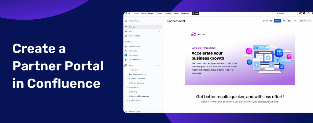
As the popular saying goes – you scratch my back, and I’ll scratch yours. So, to help our partners drive their business growth (without making any physical contact, mind you 😃), we neatly wrapped all Caelor apps materials and information in one package called Caelor Partner Portal. And if you think this is something your business might benefit from, we strongly suggest reading on. Buckle up as we take a close look at the importance of building a Partner Portal and how to do it in Confluence Cloud with the help of Caelor apps. Get ready to take your business collaborations to the next level!
Success starts on the other side of the Partner Portal
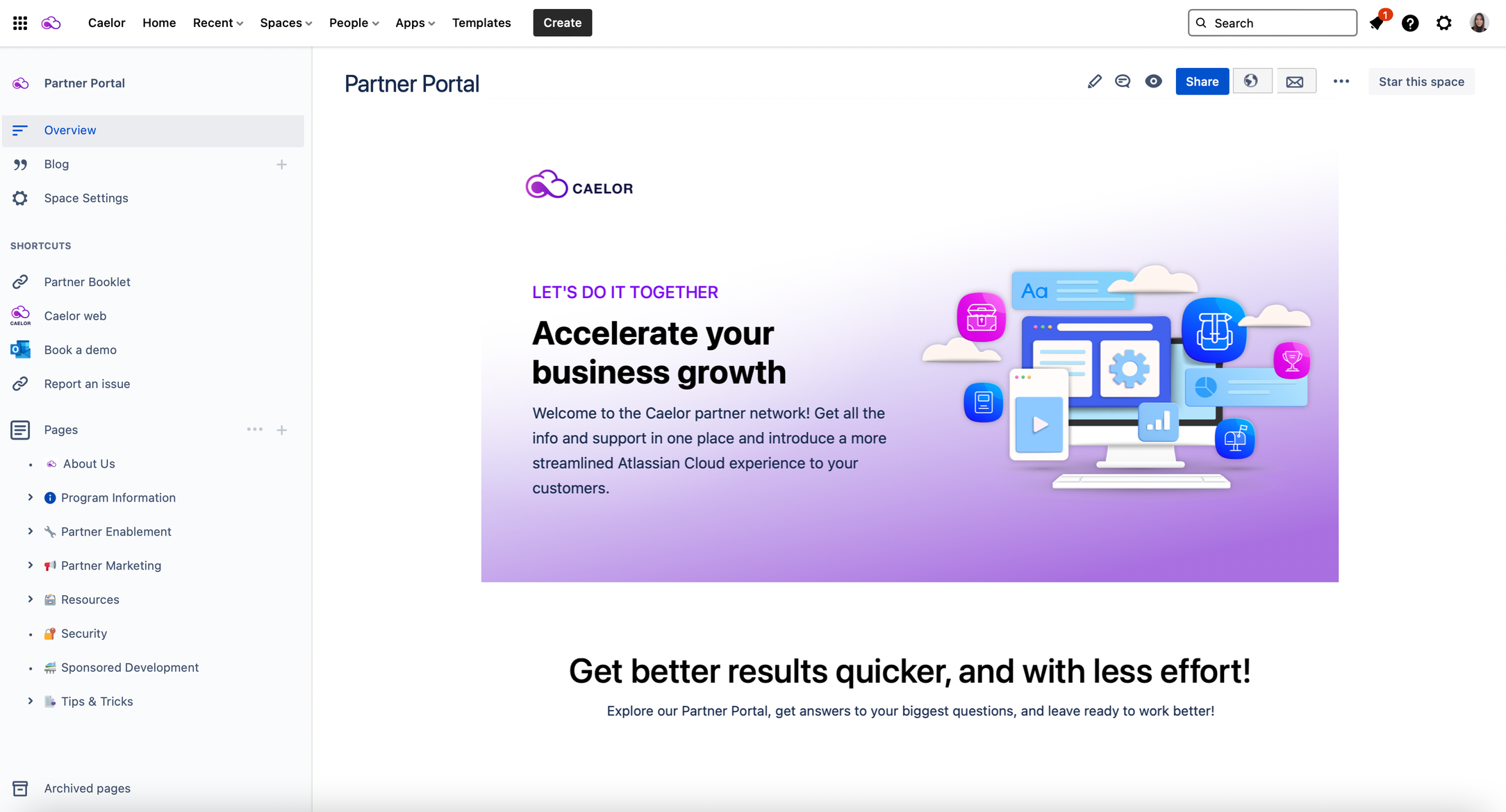
When it comes to building successful partnership relations, open and effective communication alone isn’t enough. So, it’s time to bring modern solutions into play. And Partner Portal is one such example. Simply put, the Partner Portal is a dedicated space where partners can log in to access various information, including partner enablement tools, training materials, product details, marketing materials, etc. What’s more, it proves to be a valuable tool for achieving important growth goals and boosting business revenue. Look at it this way – as it contains all the relevant information, your Partner Portal serves as a 24/7 communication channel between your team and your partners, supporting more efficient and profitable sales. To the mutual satisfaction, if we may add. However, to ensure it serves its purpose, there are certain things you should keep in mind when building one.
What to look out for when building the Partner Portal
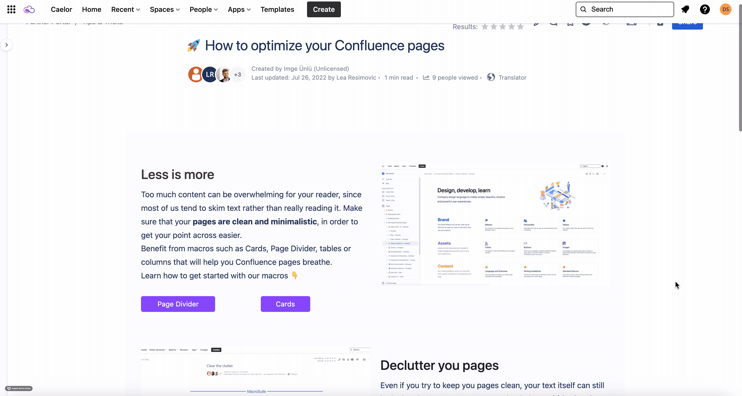
When building a Partner Portal and choosing which design components and Confluence macros to use, there are a few best practices you’ll want to be aware of. First, your team and your partners should be able to use the design you implement easily. In the end, as mentioned earlier, it serves primarily as a tool for communication. If the layout is complex, you’ll fail to get the information across. And not only will your message get lost, but you might also lose your partners in the vast Partner Portal space. Bear in mind that whoever gets to visit your Partner Portal is on a mission to find THAT specific information. And you know what they say, a friend in need is a friend indeed. Therefore, strive for simplicity and be of help.
Secondly, you must ensure your Partner Portal is visually appealing in order to draw in and engage your partner network. Basically, what you want to do is to encourage them to explore further. After all, what’s the point of gathering all the information in one place if no one will bother to look it up. Don’t get too playful, though. You don’t want to sacrifice usability to get that eye-popping appeal. At the end of the day, functional is as important as visual.
Lastly, well designed and structured Partner Portal should make the whole partner onboarding process easy and seamless. Your Partner Portal should enable you to set your partner network up for success, help them go forward, and support them in executing their sales processes. In brief, your partner portal should automate onboarding and training and provide partners with simple access to user-friendly and easily digestible materials. Speaking of user-friendly and easy-to-read, let’s look at how Caelor apps can be of assistance.
Take your Partner Portal design game to the next level with Caelor apps
When it comes to the Partner Portal’s main features, such as the dashboard homepage, the overall structure of pages, and the search bar that navigates you to the content you’re searching for – Confluence native features will suffice. However, to brand the Portal to visually represent your company and to add an overall professional aesthetic to attract partners, you’ll need more. And you will find Caelor apps to be particularly useful in this case.
Your Partner Portal should display your high standards and general care for the satisfaction and user experience of your partners. Also, the Partner Portal’s pages need to be attractive enough to leave a good first impression. And all of this is possible with rich and powerful Content Viz and MacroSuite’s macros.
Content Viz
As we already mentioned, your Partner Portal serves as the 24/7 connection between your team and your partners. This makes it the perfect channel to broadcast all of your most recent news. And if you still haven’t heard by now, there’s a hardly better way to display the latest and greatest in your Confluence space than by using Content Viz. And it’s got it all! From different content types display (blog posts, pages, people, and spaces) to multiple view options (grid, card, magazine, list, short list, compact list). So, whether you want to gather up the latest announcements, present your team, or offer an overview of the most important pages, you can easily do it in a few simple steps.

MacroSuite: Designer
Although Designer is essentially a MacroSuite macro, it gives Caelor customers access to the best features of both app worlds. Thanks to its direct integration with Content Viz, the powerful Designer macro bridges the gap between content formatting and content visualization by offering a vast range of MacroSuite and Content Viz macros in one place. Discover its full functionality and build up a stunning Partner Portal page in no time with an easy-to-use drag and drop editor. Use it to create a stunning overview page or simply add more action to your training materials (demo and how-to videos) by inserting YouTube videos.
MacroSuite: Cards
Cards could easily be the greatest thing since sliced bread. Information-packed yet easy to read and understand, cards play a significant role in delivering not just good but modern UX. Use them as a substitute for the sidebar menu and navigate your partners through your Partner Portal with style. To find out more about our cool and dazzling macro and its key features, make sure to check out our blog on Cards.
MacroSuite: Button
With our recently redesigned Button macro, the call to action never looked more tempting. Add it to your contact page, use it to redirect your partners to your social media, or make the download of your materials easier. Explore the customization options and find the one that perfectly fits your design.
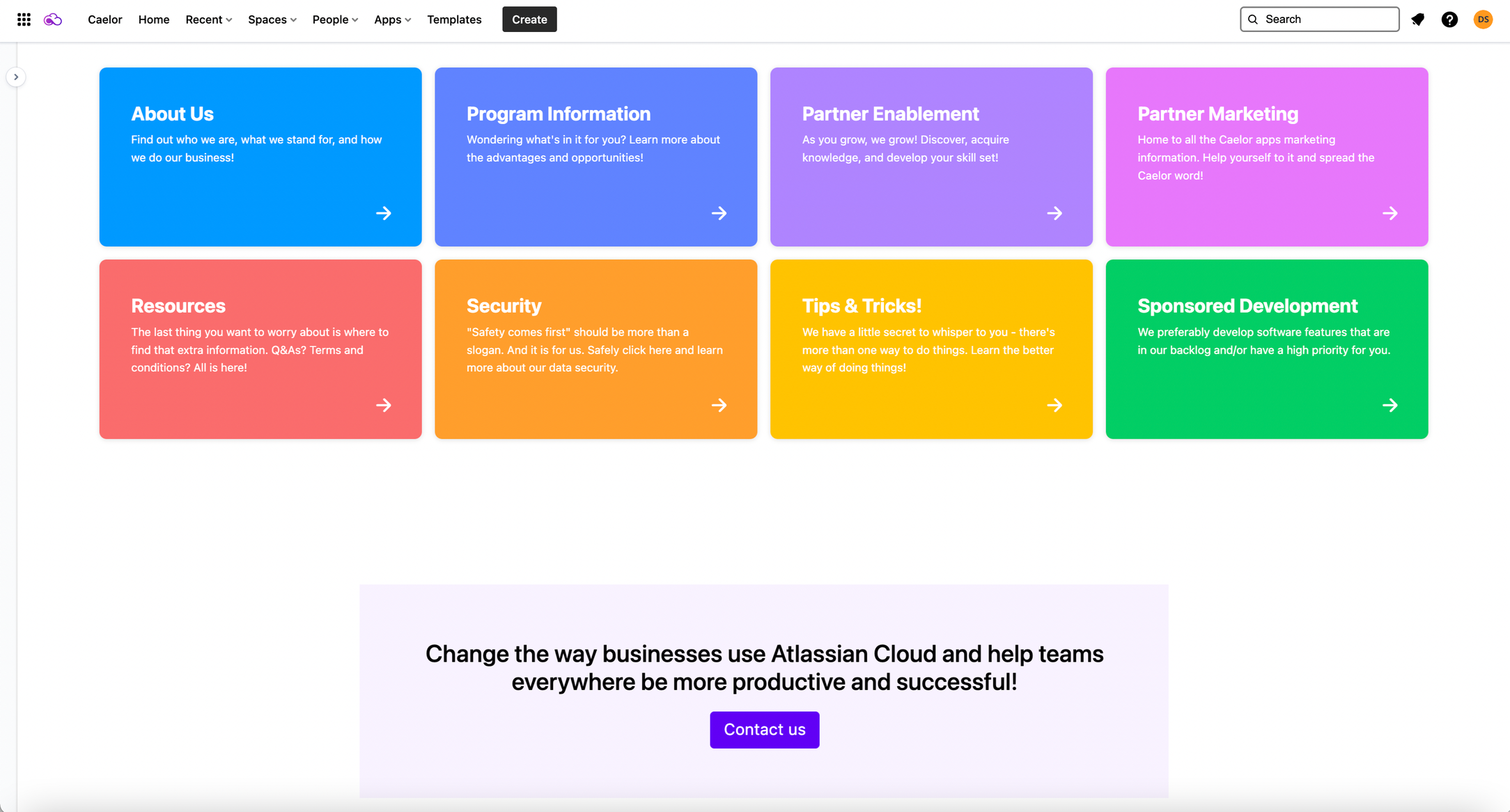
MacroSuite: Title and text
Make your title and text stand out and add an extra style with the MacroSuite Title and text macro. Structure your content with powerful sections using title, text, and overline, and draw your partners’ attention in the right direction.
To sum it up
In short, well designed Partner Portal will make your partnerships more efficient as it will help your partners to:
- Improve their performance
- Speed up their selling process
- Boost their customers’ satisfaction
- Increase their revenue
Your Partner Portal is a potent sales tool, so make sure it’s easy to use, pleasing to the eye, and packed with the material your partners will find useful.
Curious to know what else we got in our Partner Portal? Sorry. Partners only. But that can easily be changed, though. Get in touch today and grant yourself access to all things Caelor!