Since your navigation menu serves as your Confluence map, it’s crucial to structure it well. But beware! It’s far too simple to fall into the trap of believing that it’s best to display everything there. After all, that way, users are sure to find what they need. Well, not quite. Hold your horses and give it some more thought. This “more is more” approach to creating the navigation menu actually isn’t the way to go. The reality is that clear and short navigation menus perform best. And here are 5 tips on how to perfect your Cosmos Navigation Menu so it’s more user-friendly and engaging.
1. Well begun is half done.
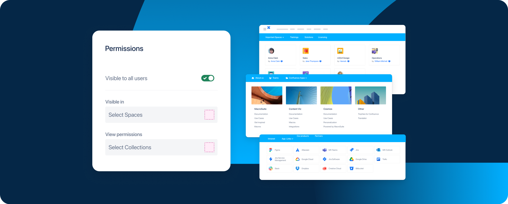
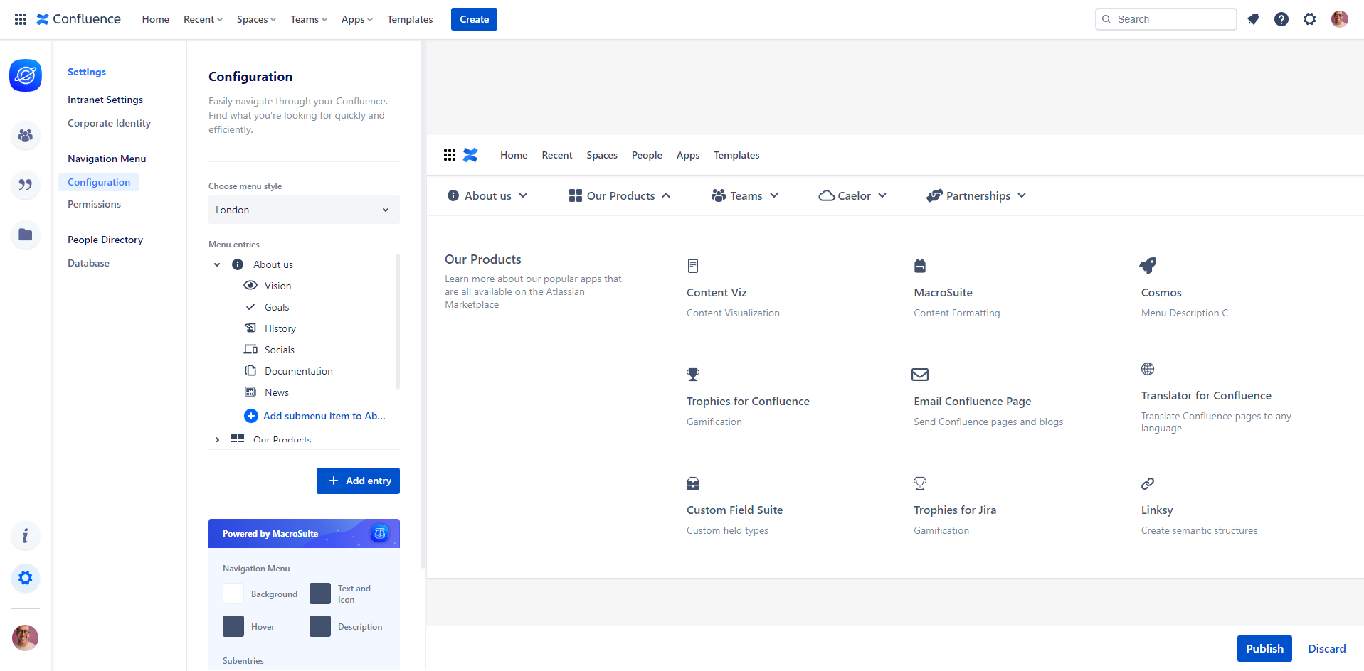
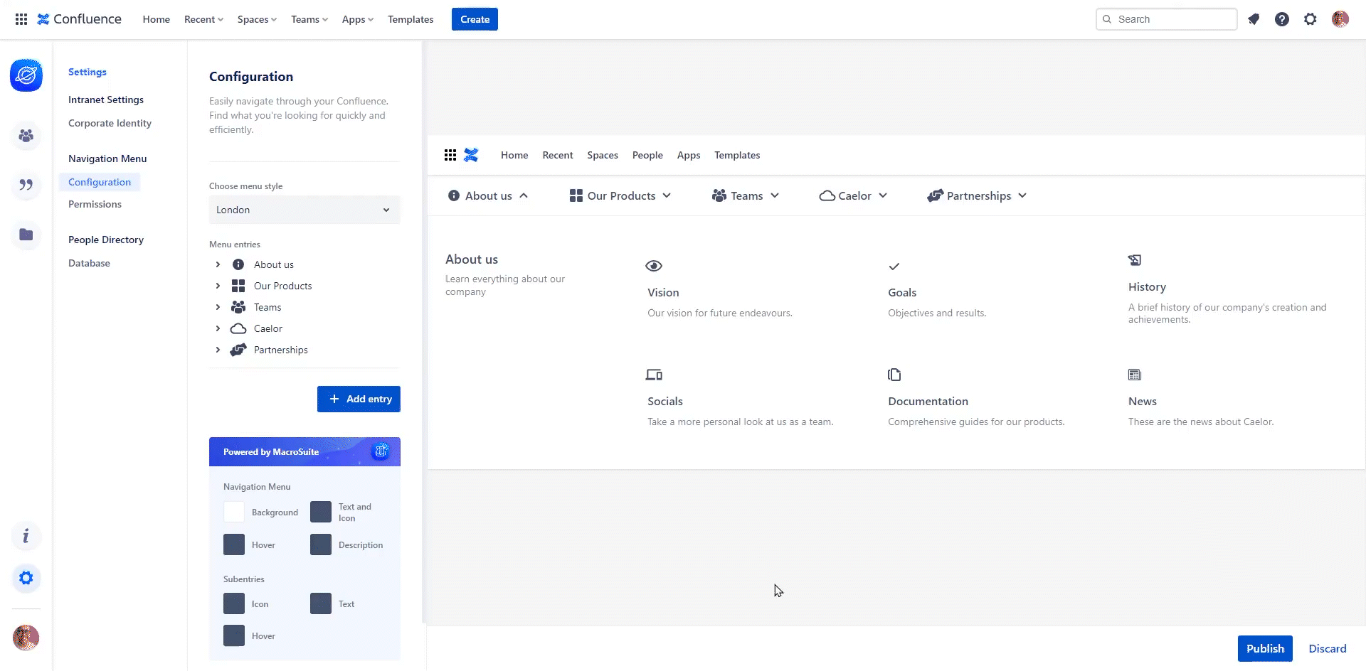
Consider the navigation menu’s overall structure before you begin building it. Otherwise, you might be the first to get lost while trying to find the right way. Ensure your navigation menu’s outline is logical, intuitive, simple, and concise. And, by all means, don’t forget to make it clickable. Add a link to your submenu entry and easily redirect your readers to a new location.
2. Keep it short and simple.
Don’t distract or overwhelm your users. When creating a navigation menu bar, a general guideline is to keep it to 5 to 7 menu entries. Keep in mind that the users are more likely to abort the mission if they have to go through many options. Aim for a brief navigation menu so the users can read through it more quickly and easily. Also, a brief, single-line navigation bar makes your Confluence page look more professional and comprehensible.
3. Get straight to the point.
Make sure the names of your menu entries are short, relevant, and easy to understand. Keep your users from speculating about where the navigation will lead them. Instead, make sure they know exactly where they’re going next and provide a good user experience. Always remember, a good navigation menu should make the whole process easy and smooth.
4. Use icons and colors.
Not only do icons make a navigation menu easier to use, but they also make it more individualized and enjoyable. Also, when used correctly, they can significantly improve the overall visual appeal. So, make sure your icons complement the rest of your design, and don’t forget to select simple and meaningful ones to avoid confusion.
Also, don’t be shy to add a splash of color to your Cosmos Navigation Menu so you can navigate your Confluence with style. Flaunt your swag corporate identity, add your brand colors, and glam up your workspace with the color customization feature available as a part of the MacroSuite integration to Cosmos.
5. Cut, cut, and then cut some more.
It’s possible that some navigation menu entries won’t even be needed. Less is more in this case, which is the main thing to keep in mind. Aim for the fewest navigation menu options while making the process easy, informative, and user-friendly.

Let’s wrap it up!
Your custom navigation menu is much like a Confluence road sign that guides your users in the right direction. And it’s entirely up to you to decide what to include and prioritize since there are no strict rules for creating one. However, we recommend keeping your creative spirit in check on this occasion. Whatever you choose to add to your navigation menu in the end, just make sure it’s straightforward and simple to understand.
Wait, did we hear someone call out “Encore“? Ok, here comes a bonus tip! 😉 To ensure your users have the best experience and you’re getting the results you want, keep testing and making adjustments. And if you still need help creating and designing your custom navigation menu in Confluence, get in touch, we’d be happy to assist.